Exercise 1: Mixed messages
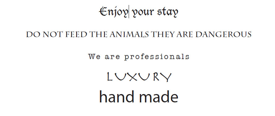
1.”Enjoy your stay” is a common phrase associated with hospitality. So the places we expect to view it is at hotels or other types overnight accomodation. The typography feels Gothic, therefore the overall effect evokes an image of a type of historic accommodation site like a castle, mansion or theme park. It also brings popular characters / movies into mind, such as Dracula, adams Family and the Rocky Horror picture show.
2. “Do not feed the animals they are dangerous” – The message is reminiscent of a zoo or safari park sign, a place where animals are generally displayed. Yet the typography has a somewhat mid evil style, which creates another historic effect similar to phrase no 1, this time the imagery that comes to mind is of magical beasts, dragons or some dangerous animals out of Harry Potter books.
3. “We are professionals” This is generally a common persuasive marketing statement, the fonts we would expect with this statement are usually visually attractive fonts that would associate with sleek and smart designs. The fact that a common, unnecessarily attractive font is used, makes the visual mind doubt the message or statement.
4. The word ”Luxury” along with particular typography reminds me of something Egyptian, or another ancient script. Especially due to the way the Us look. Although the word says luxury, I keep imagining it says “Luxor”, which has a really amusing effect. I’m also thinking about queen Cleopatra, a luxurious lady who might actually be placed in Luxor.
5. In this case: “Hand Made” has no special effect on the mind as the fond is extremely plain and common. It does not spark any curiosity to continue exploring or reading beyond the statement.
Exercise 2: Re-contextualising images
Research point
John Heartfield
Quick biography notes:
“John Heartfield (born Helmut Herzfeld; 19 June 1891 – 26 April 1968) was a German visual artist who pioneered the use of art as a political weapon. Some of his most famous photomontages were anti-Nazi and anti-fascist statements.”
“He created book jackets for book authors, stage sets for contemporary playwrights, In 1908, tudied art in Munich at the Royal Bavarian Arts and Crafts School. In 1917, Heartfield became a member of Berlin Club Dada.Heartfield would later become active in the Dada movement, helping to organise the Erste Internationale Dada-Messe (First International Dada Fair) in Berlin in 1920. Heartfield lived in Berlin until April 1933 when the Nazi Party took power. On Good Friday, the SS broke into his apartment, but he escaped by jumping from his balcony and hiding in a trash bin. He fled Germany by walking over the Sudeten Mountains to Czechoslovakia. He eventually rose to number five on the Gestapo’s most-wanted list. he was forced once again to flee from the Nazis, this time to England. He was interned as an enemy alien, and his health began to deteriorate. Afterward, he lived in Hampstead, London. His brother Wieland was refused a British residency permit in 1939 and instead left for the United States with his family. Postwar: He was interrogated and released having narrowly avoided a trial for treason, but was denied admission into the East German Akademie der Künste (Academy of the Arts). He was prohibited to work as an artist and was denied health benefits.”
John Heartfield, (7/3/21) Wikipedia, available on: https://en.wikipedia.org/wiki/John_Heartfield accessed 20/5/20
My impression: Heartfield achieved powerful visual messages and sacrificed his own freedom, fighting for his saying and ideology. His brave anti-Nazi protest visual statements are extremely honest, meaningful and memorable. Below are 3 works that I found especially meaningful:

By John J Heartfield, AIZ Magazine
July 17, 1932, Berlin, Germany
“’Adolf The Superman” is John Heartfield’s famous portrait of Adolf Hitler with his chest and belly full of gold from his financial backers. It is certainly one of the most famous political posters. Heartfield combined an actual photo of Hitler with an x-ray to create this unforgettable image of a politician spouting ugliness to help move his country toward a profitable war.”
Text and image available on: johnheartfield.com accessed 20/5/20
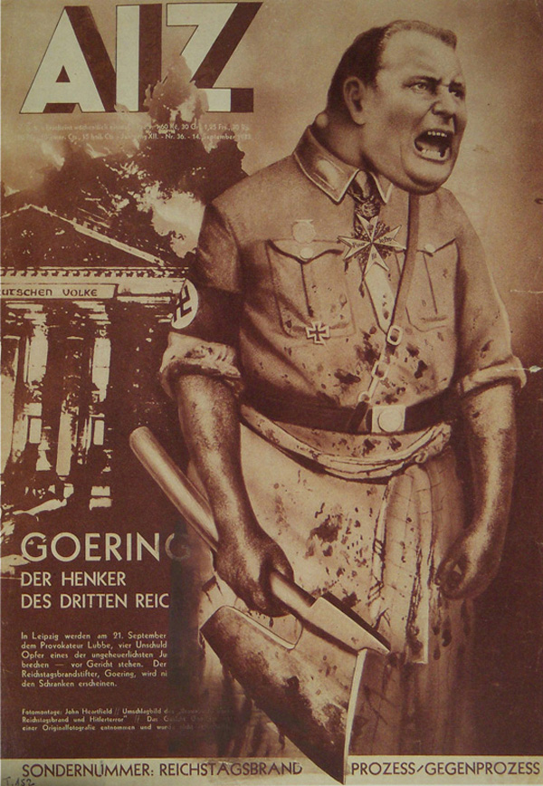
By John J Heartfield, AIZ Magazine
September 14, 1933, Berlin, Germany
“John Heartfield was on the run from the SS when his portrait of Goering as the man truly responsible for the burning of the German Reichstag. Heartfield was number-five on the Gestapo’s Most Wanted List when the Nazis invaded Czechoslovakia. Heartfield’s famous political art commentary is a lesson as well as a masterpiece of political art.”
Text and image available on: johnheartfield.com accessed 20/5/20
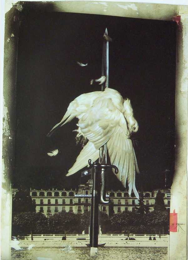
By John J Heartfield, AIZ Magazine
November 27, 1932, Berlin, Germany
“Heartfield’s impaled dove of peace is universally regarded as a masterpiece of political imagery. It is certainly one of Heartfield’s most famous and dramatic political statements.
The collage (photo montage) of the dove of peace on a bayonet is shown before the League of Nations building. A swastika replaces the Swiss flag.
In religious terms, the dove may symbolize the Holy Spirit or the human soul. The dove with an olive branch in its mouth is a symbol of peace in the biblical story of Noah’s arc. Heartfield drew inspiration from his impressive memory of text and images.”
Text and image available on: johnheartfield.com accessed 20/5/20
Peter Kennard
Quick biography notes:
Peter Kennard (born 17 February 1949) is a London-born and based photomontage artist and Senior Research Reader in Photography, Art and the Public Domain at the Royal College of Art. Seeking to reflect his involvement in the anti-Vietnam War movement, he turned from painting to photomontage to better address his political views. He is best known for the images he created for the Campaign for Nuclear Disarmament (CND) in the 1970s–80s including a détournement of John Constable’s The Hay Wain called “Haywain with Cruise Missiles”.
Because many of the left-wing organisations and publications he used to work with have disappeared, Kennard has turned to using exhibitions, books and the internet for his work.
Kennard has work in the public collections of several major London museums and the Arts Council of England. He has his work displayed as part of Tate Britain’s permanent collection and is on public view as part of 2013’s rehang A Walk Through British Art.
Peter Kennard, (21/2/21) Wikipedia, available on: https://en.wikipedia.org/wiki/John_Heartfield accessed 20/5/20

Peter Kennard
1974
“Between 1973 and 1974 Kennard worked as the full-time photomontage artist for the Workers Press, the daily paper of the Socialist Labour League. He says: ‘The point of my work is to use easily recognisable iconic images, but to render them unacceptable… to show new possibilities emerging in the cracks and splintered fragments of the old reality.’ Apartheid South Africa was used to accompany an article in Workers Press on ‘The Iron Heel, British Investment in South Africa’.
Gallery label, September 2018“
Text and image available on https://www.tate.org.uk accessed 20/5/20

Peter Kennard
1980
“Photomontage Posters on Civil Defence in London (based on Haywain with Cruise Missiles) (1985) All four of these images were produced by Peter Kennard, a British artist whose work has become synonymous with political protest. Kennard began to use the technique of photomontage when involved in anti-Vietnam War activities. It became his signature style, which he has used to produce some of the iconic images of modern anti-nuclear and anti-war protest. Protest and Survive“
Text and image available on: https://www.iwm.org.uk, accessed 20/5/20
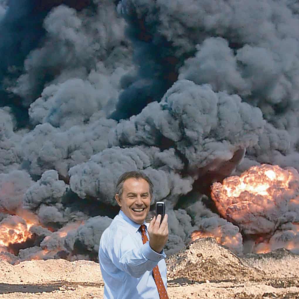
Peter Kennard
2010
“Tony Blair grins for his photograph as he holds up his smartphone to take a selfie. He’s delighted with himself and what he’s done. Behind him, black smoke and hellish flames bloom over an arid landscape. To many people, this grotesquely comic moment says it all – only Blair would think that’s a good photo opportunity.
Photo Op, as their photomontage is called, has become the definitive work of art about the war that started with the invasion of Iraq in 2003. Ten years on from that war’s beginning, this manic digital collage states succinctly what a large number people feel and believe about Blair’s responsibility for the chaos that ensued.”
Text and image available on:
https://www.theguardian.com/ accessed 20/5/20
Hannah Höch
Quick biography notes:
“Hannah Höch (German: [hœç]; 1 November 1889 – 31 May 1978) was a German Dada artist. She is best known for her work of the Weimar period, when she was one of the originators of photomontage. Photomontage, or fotomontage, is a type of collage in which the pasted items are actual photographs, or photographic reproductions pulled from the press and other widely produced media.
The influence of this early work and training can be seen in a number of her collages made in the late 1910s and early- to mid-1920s in which she incorporated sewing patterns and needlework designs.
Höch spent the years of the Third Reich in Berlin, Germany, keeping a low profile. She was the last member of the Berlin Dada group to remain in Germany during this period. She bought and lived in a small garden house in Berlin-Heiligensee, a remote area on the outskirts of Berlin. She suffered from the Nazi censorship of art, and her work was deemed “degenerate art”, which made it even more difficult for her to show her works
“Höch’s photomontages display the chaos and combustion of Berlin’s visual culture from a particularly female perspective” (Makholm). “Höch was not only a rare female practicing prominently in the arts in the early part of the twentieth century—near unique as a female active in the Dada movement that coalesced in her time—she also consciously promoted the idea of women working creatively more generally in society. She explicitly addressed in her pioneering artwork in the form of photomontage the issue of gender and the figure of woman in modern society” (The Art Story). “
Hannah Höch , (21/2/21) Wikipedia, available on: https://en.wikipedia.org/wiki/Hannah_H%C3%B6ch accessed 20/5/20 accessed 22/5/20
My impression: Höch‘s collages are full of visual drama and personal expression, each detail in her work has a subtext, forming a window into her mind, ideas and views on the art world, the role of women and society.
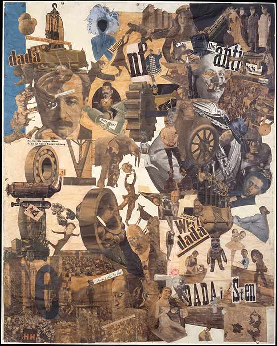
Hannah Höch
collage, mixed media, 1919–1920
If we look closely at the cacophony of seemingly random images that make up Hannah Höch’s large-scale photomontage, a cross-section of Weimar Germany’s cultural and political milieu comes into focus. Here, the “Kitchen Knife Dada”—a metaphor for Höch’s careful slicing and dicing—cuts a swath from lower right to upper left, separating Dada and “anti-dada” elements. “
Text and image available on: https://www.khanacademy.org accessed 21/5/20

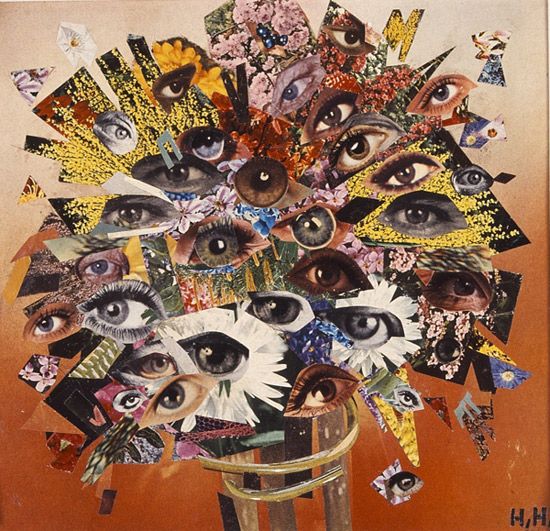
Hannah Höch
collage, mixed media, 1930
“In the collage you can see a number of eyes, arranged in such a manner to look like a bouquet of flowers, this is the main subject of the collage. The orange background colour portrays a relaxing mood, however this sense of ease is destroyed by the fact that all the eyes seem to be starring straight at the viewer all the time, as the eyes in the bouquet are focusing in all different directions, meaning you can not escape their gaze. This collage is said to engage with the ideas and themes of feminism and sexism in her work, as the eyes with the eye lid included are very recognizable as male or female.”
Text and image available on http://thisisallart.blogspot.com/2015/04/hannah-hoch.html accessed 21/5/20
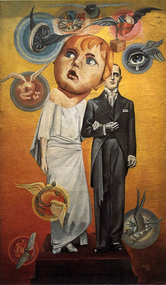
Hannah Höch
collage, mixed media, 1927
“It features a wide-eyed child looking for all the world like an innocent lamb to the slaughter. Anxiously anticipating her new role as mate to her wooden, unresponsive husband, she looks with apprehension at the symbols of maternity and fidelity that float around her. The two figures are standing on a raised platform, like a mount onto which a statuette might be fixed, making them look like an adornment on a wedding cake. The couple look artificial and entirely representational of a stereotypical symbol of marriage rather than a real married couple.”
Text and image available on: text and image : medium.com accessed 21/5/20
Martha Rosler
Martha Rosler works in video, photography, text, installation, and performance. Her work focuses on the public sphere, exploring issues from everyday life and the media to architecture and the built environment, especially as they affect women.
Rosler has for many years produced works on war and the national security climate, connecting life at home with the conduct of war abroad, in which her photomontage series played a critical part. She has also published several books of photographs, texts, and commentary on public space, ranging from airports and roads to housing and gentrification.
A retrospective of her work has been shown internationally, and her writing is published widely in publications such as Artforum, e-flux journal, and Texte zur Kunst.
In 2012, she presented a new series of photographs, taken during her trip to Cuba in January 1981, and in November, she presented the Meta-Monumental Garage Sale at MoMA in New York. In 2013, her book of essays, Culture Class, which deals with the role of artists in cities and gentrification, was published by e-flux and Sternberg Press. Most recently, she produced the exhibition and public project Guide for the Perplexed: How to Succeed in the New Poland at the CCA Ujazdowski Castle in Warsaw, Poland.
Rosler lives and works in Brooklyn.
“Martha Rosler: I use more digital imagery than I used to, and I am more likely to orchestrate events with a number of participants, but those are largely technical issues, I think. Otherwise, I am not sure the basic impulses of my work have changed much. My audience has no doubt broadened as the art audience has expanded and internationalized, as time has passed, and as the internet has become the primary means of disseminating imagery and commentary. In the case of anti-war photomontages, I have consciously chosen, in effect, to quote my own method of work from forty years previously in order to create a meta-level commentary about the failure of our political class to learn anything from history. Today, we have new wars of choice that are being waged with the old mindset, so I chose to use the same mode of address: the photomontage.”
Bree Hughes, (07/19/2013) , Q & A with Artist Martha Rosler, Artnet news (online art magazine), available on: https://news.artnet.com/art-world/q-amp-a-with-artist-martha-rosler-49391, accessed 22/5/20
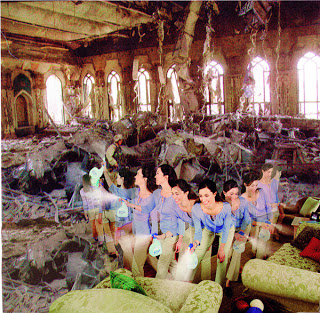
Martha Rosler
2008
“This is a masterfully put together photo montage of a middle-aged woman cleaning her couches and a soldier wandering in a destroyed building. The exposure is perfect and the motion is very fun to observe. Martha Rosler’s technique at capturing individual detail in the background as well as the foreground is admirable, because it’s hard to tell whether the subject should look at the battleground or the woman cleaning. This unusual combination of wartime chaos and domestic tranquility are completely incompatible with each other. For example, the soldier and woman are so engrossed in their own world they don’t notice the other world exists. And the aesthetic surroundings of the sitting room completely clash with the ugly war-torn scene. This photograph is too politically minded for me to consider it a masterpiece, but this photo is still very eye-clashing.”
Text and image available on: http://jegelskerscandinavia.blogspot.com/ accessed 21/5/20

Martha Rosler
2008
“The photos are collages, taking war-photographs from Vietnam, Iraq, and Afghanistan, and combining them with pictures from home and architectural magazines. Rosler has gone to state that she was trying to “show that the ‘here and ‘there’ of our world picture, defined by our naturalized accounts as separate or even opposite, were one”. The clash of these beautiful, ideal, home interiors against the often violent imagery from war creates a striking image. By collaging these images together, Rosler takes the conflict and places it directly in our domestic environment, making it impossible to ignore.”
Text and image available on: https://justineelkhazen.wordpress.com accessed 21/5/20
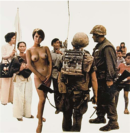
Martha Rosler
1967-72
“Rosler conceived Bringing the War Home during a time of increased intervention in Vietnam by the United States military. Splicing together pictures of Vietnamese citizens maimed in the war, published in Life magazine, with images of the homes of affluent Americans culled from the pages of House Beautiful, Rosler made literal the description of the conflict as the “living-room war,” so called in the USA because the news of ongoing carnage in Southeast Asia filtered into tranquil American homes through television reports. By urging viewers to reconsider the “here” and “there” of the world picture, these activist photomontages reveal the extent to which a collective experience of war is shaped by media images..”
Text and image available on:
https://www.moma.org accessed 21/5/20
My own attempt of political collage
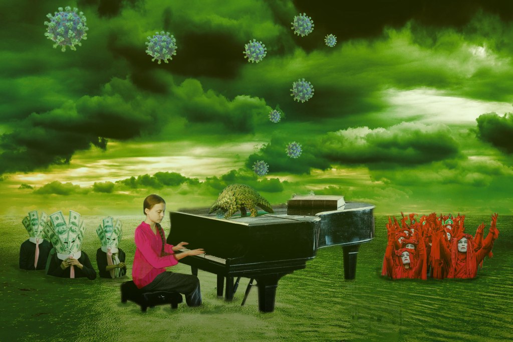
Whiling researching artists for this exercise, I enjoyed observing the use of combined imagery for expressing political ideas, protests and commentary. I though of trying a similar idea. For the collage attempt exercise, I collected and combined popular news images and visual elements from 2019 – 2020.
The final result, is an image which indicates my own visual protest, my own vision connecting between the events of 2019 with 2020.
The scene is dark and an apocalyptic gloom is amplified through shades of emerald.
Greta symbolizes the future, the performer and prophet, the grand piano represents the music, sound or voice. In the image created, she is playing the piano but she’s no longer speaking as she is tired of the deaf ears and public mockery. All she can do now is silently play her tune.
A pangolin sits upon the piano – it’s listening to the music as Covid-19 viruses, form like bubbles and float into space. This symbolizes the link between our actions and the 2020 pandemic, originating in wildlife and habitats we have destroyed as a species.
The audience of the symphony is made of two separate spectator groups. First are the Extinction Rebellion red women, reaching out or calling onto the skies. The women are visually connected to Greta, the vivid red bonds them and portrays femininity, wisdom and hope. Just like her, their message is not heard at the moment, they are sinking.
The second group are “money masked” businessmen from the ”Reclaim Wall street” protests, representing human greed and the blindness of capitalism.
Everyone is wading in a flood of rising water, yet all seem oblivious to the danger. This symbolizes human leadership’s inaction towards the risks arising from global warming and over consumption. They are aware of danger, yet intentionally ignore the problem.
Exercise 3: Film posters

For this exercise, I have chosen a film which was one of the most influential science fiction productions ever made: Metropolis. The film’s breakthrough futuristic art and visuals that were revolutionary at the time have, and are still inspiring science fiction films today. The movie featured a glimpse into life as a future society as well as a social commentary on equality and social justice.
The film poster is very appealing, created in a notable Art Deco graphic style, beautiful and everything had clearly been hand drawn. Like the film of it’s time, it is black and white. The design includes many angled elements, including the lettering, which make an effort to look modern and futuristic. We see the same design style within many of the famous movie sets and scenes. The center includes a portrait of the humanoid robot, with empty eyes starring forward into space, we see the tall, busy and lit metropolis standing in the background. The logo of UFA GmbH studio, shortened to UFA appears twice on both bottom corners.
The poster itself is considered an important piece of modern Art Deco and futurism: ”This is the first model of arguably the most beautiful poster ever designed, by German graphic artist Heinz Schulz-Neudamm. The domestic German three-sheet for Fritz Lang’s silent masterpiece Metropolis from 1927.” Existing poster copies are now prized, fetching record prices of $850,000.
Quotes and image: Jose Juan Barba (16/01/2017) Metropolis The Most Expensive Movie Posten, Metalocus article (online) available on: https://www.metalocus.es/en/news/metropolis-most-expensive-movie-poster, accessed 22/5/20
While researching ‘Metropholis’ I found an interesting connection between specific film frames in the famous dance scenes: an array of starring eyes and Bouquet of eyes by Hannah Höch. The location of both artworks is Berlin, Metropolis was released in1927, while Bouquet of eyes by Hannah Höch in 1930. It’s a possibility that the sensational film was the inspiration for her specific artwork?
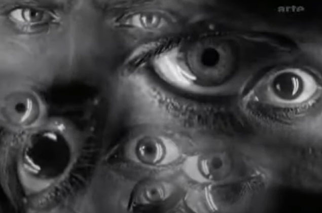
Frame from ‘Metropolis’ (movie), available on: https://www.youtube.com/watch?v=SArNZEcQWH4 accessed 22/5/20
Hannah Höch (1930), ‘Bouquet of eyes’
collage, mixed media, image available on http://thisisallart.blogspot.com/2015/04/hannah-hoch.html accessed 22/5/20
I would like to extend this exercise by addressing the use of lettering, typography and moving image in the opening TV show I absolute love: “Stranger Things”.
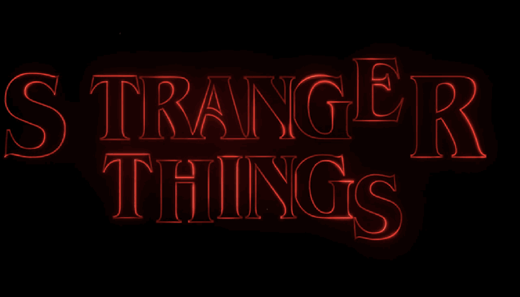
The typography is connected to the concept of the show in multiple ways: the target audience was anywhere between teens and those kids who grew up in the 80’s, who would understand the show’s subtle messages and salutes to 80’s retro pop culture, targeting age groups 15-50.
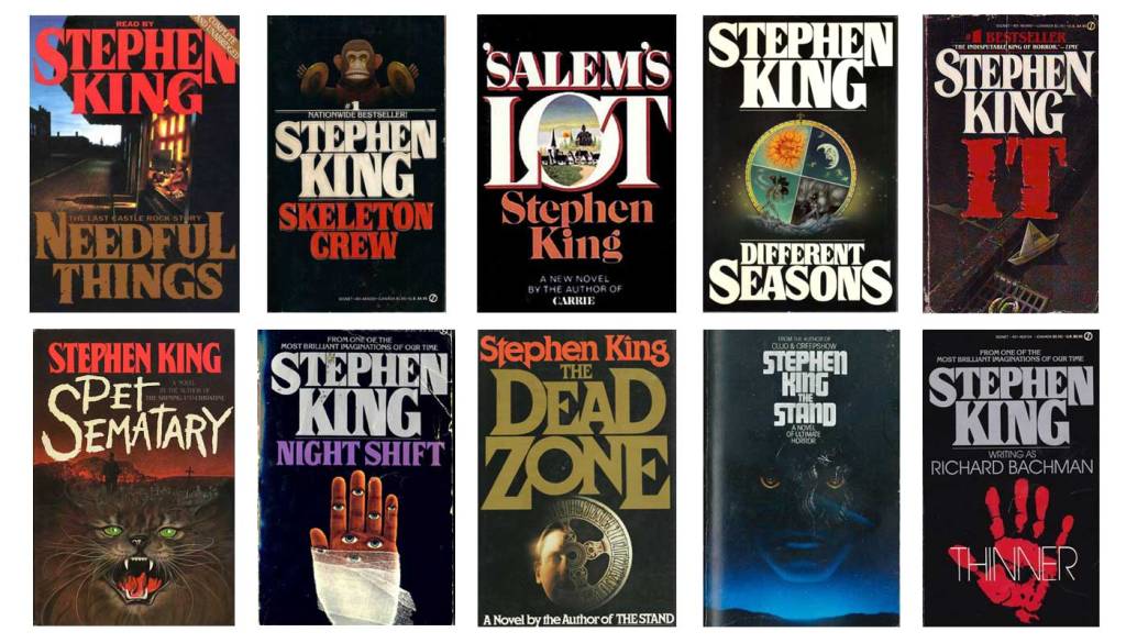
The font and color: The title typography is a modification of a font called ITC Benguiat, created by New York typographer Ed Benguiat in 1977, who at the time, was inspired by Art Nouveau fonts. It was selected over 20 other design options for the feelings and associations it evokes, mainly reminiscent of the Stepen King suspense titles and several 80s movie posters from the era.
The style and effect: Even before any read up or research, the lettering style over background seems nodding to ”Star Wars”. There are several Star Wars inspired ideas and characters in the show, this repeats again in the design of the show’s poster, seen below.

Another obvious inspiration is found in the classic “Alien” series. The slight gradient glows, adds an effect which supports a dark atmosphere and feel of suspense.
Research link and image available on: https://time.com/4984529/stranger-things-font/ accessed 24/5/20
https://www.telegraph.co.uk/on-demand/0/stranger-things-all-the-hidden-and-not-so-hidden-references-in-p/the-thing/ accessed 25/5/20
